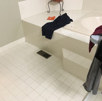
We recently worked with a repeat homeowner on the complete remodel of the master bathroom. The original bathroom was functional but featured all builder grade materials and the homeowner wanted the master bathroom to be a place that felt more luxurious and relaxing.
The homeowner and Ralph, owner of RJE Home, decided that this bathroom would be best for a complete gut and remodel. We worked with the homeowner to put on paper a new design for the master bath. We decided on materials in a neutral gray color palette to accomplish the style and relaxing look they were going for.
Initially, the homeowner was unsure whether to go through with the master bathroom remodel as they are the only ones who use and see the bathroom. That said, with the remodel now complete, the homeowner is very happy they decided to go for it!
Below we’ve highlighted some key changes we made to the space.
Vanity
The original space featured a cream-colored double vanity with no cabinet shelving, making storage a bit difficult. The countertop was a cream-colored builder grade faux marble that stained easily. We replaced this with a new 72-inch white double vanity featuring a white carrera marble countertop. The new vanity contains plenty of storage with shelving and drawers and is accented with brushed nickel cabinet pulls and fixtures. On the wall above the sinks, we also added new lighting and medicine cabinets to complete the space.
Shower
Opposite the vanity and toilet, the shower originally had three tiled walls with a full glass door to make up the fourth side. The shower also had a fiberglass shower basin and no space to hold toiletries. In upgrading the shower, we removed the back wall and added a new custom made frameless glass shower enclosure with pivot door on the front face and right side of the shower. This opened the room visually and made the shower feel brighter. For the base of the shower, we created a sturdier basin with pebble tile flooring outlined with white carrera marble. We also used white carrera tile on the walls and added in a shower niche accented with the same pebble tile on the floor for toiletries. Brushed nickel fixtures were also added.
Tub
At the bay window area of this bathroom, the original drop-in bathtub featured a complete, wall-to-wall, tiled and framed “bench area”. We and the homeowner felt this was wasted space. We completely removed the tub and corresponding “bench area” and added in a new standalone white clawfoot tub with brushed nickel fixtures. This simple switch added more floorspace to the room and made the room appear larger.
Walls and Flooring
In addition to the tile framing around the tub, the original bathroom featured the same 3x3 cream colored tile on floor and walls, up to chair rail height in some areas. After removing the wall tile, we replaced it with a white wainscot all around the room and painted the rest of the room with Sherman William’s Gray Screen (SW7071). The floor tile, when removed, was replaced with a larger rectangular shaped durable gray porcelain woodplank tile.
The completed bathroom appears more spacious and allows for more light, creating the luxurious and relaxing environment the homeowner was dreaming of – a favorite room of the house.


